All work

Case study

Journey Automation

Product Designer Bloomerang CRM 2023 2 scrum teams · 8 developers · 2 PMs
crm.bloomerang.co / journey-automation
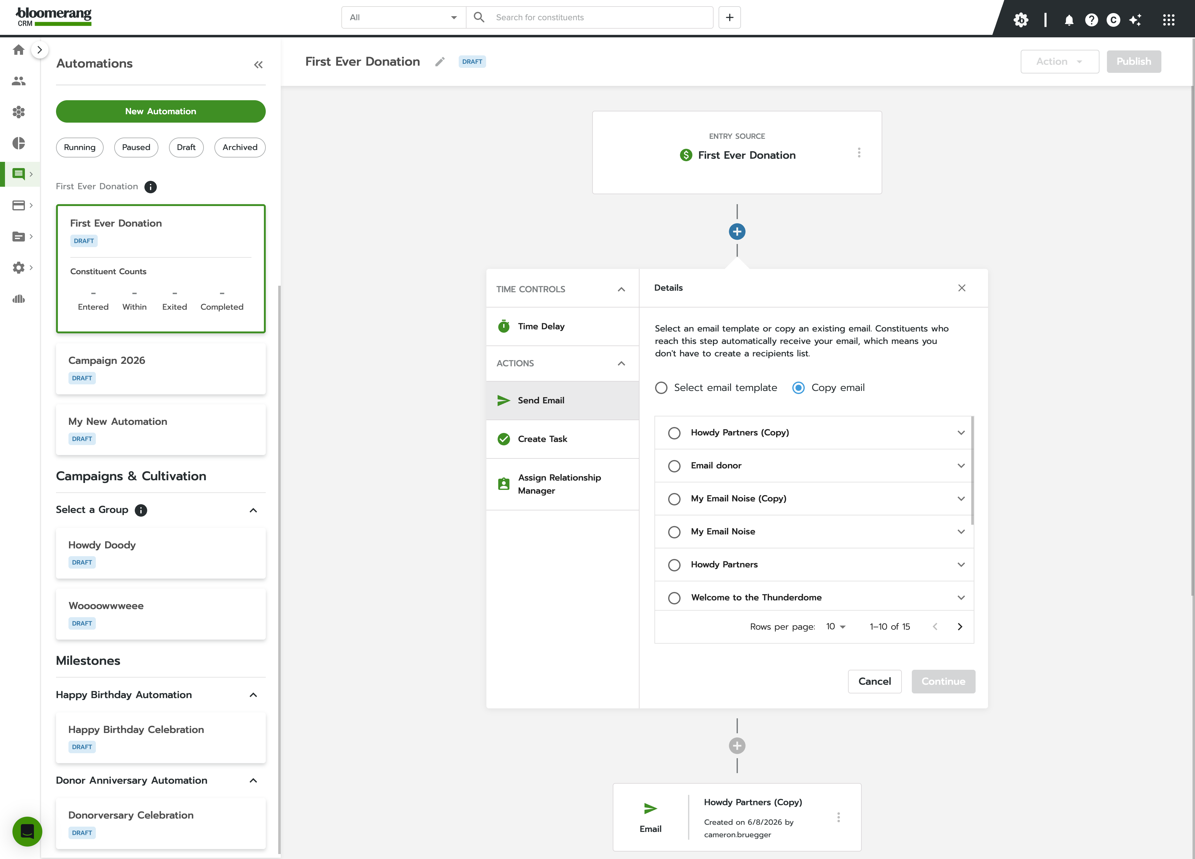
The Journey Automation builder showing a published donor journey: entry source, an email, a 4-day wait, a follow-up task, and an end step.
The management view was as important as the builder. Multiple automations run simultaneously, each with a status badge and inline constituent counts — a fundraising coordinator can see the health of their entire engagement system at a glance, without opening a single automation.

01 — Situation

Nonprofit fundraising runs on relationships — but relationships don't scale easily.

I led the design for Journey Automation, a new tool inside Bloomerang's CRM that would let nonprofit staff automate donor engagement at scale — without needing a marketing-ops background to use it.

02 — The real problem

A bottleneck, not a feature gap

Staff were reaching out to donors one by one — finding the right people, writing individual emails, hitting send, repeat. At small nonprofits with lean teams, that's not just tedious; it's a strategic bottleneck.

The organization's ability to retain and grow its donor base was capped by how many hours someone could spend in a spreadsheet. The CRM had the data to do better. It just didn't have the tooling yet.

03 — What I decided, and why

Approachability over flexibility

The automation tools on the market were powerful but built for marketers — conditional logic stacks, branching workflows, API triggers. Not for a fundraising coordinator at a 10-person nonprofit. The temptation was to match competitors feature-for-feature.

Instead, I pushed to curate the tool around real nonprofit scenarios and make each one dead simple to configure. The tradeoff was flexibility for approachability — templates became the entry point, and customization was still there, just not the default.
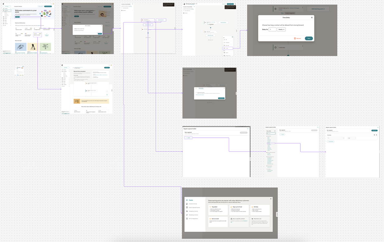
A competitive research board mapping automation tools, with screenshots of competitor builders connected by flow lines.
I mapped the competitive landscape before touching Figma. The pattern was consistent: powerful tools built for power users — more actions, more branching, more complexity. The insight wasn't what to copy — it was what to leave out.
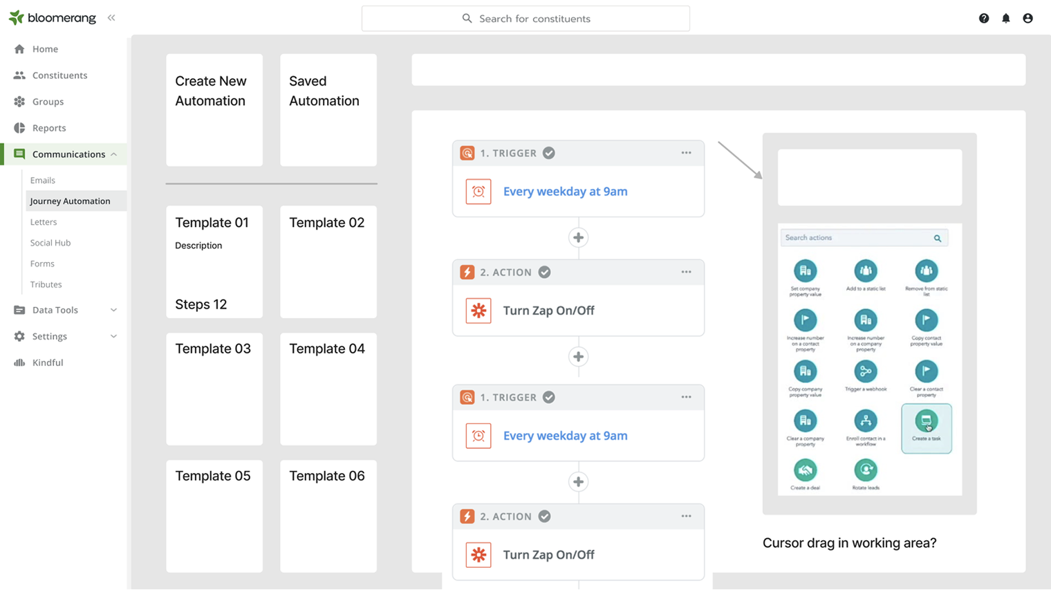
An early wireframe of the automation builder: a template gallery as the entry point, a vertical trigger-and-action canvas, and an action picker panel.
Early wireframe exploration — the skeleton the final product grew from. Templates as the front door, a vertical step-by-step canvas instead of a free-form node graph, and a curated action picker. Even the open questions in the margins (“cursor drag in working area?”) were about keeping the builder legible for a non-technical user.

04 — What we shipped

A curated builder, organized the way fundraisers think

Templates became the entry point; full customization stayed one click away. Users could build, start, pause, archive, and report on multiple automations from one interface — and the left nav kept everything organized by how fundraisers actually think about their work, not how engineers would architect a system.
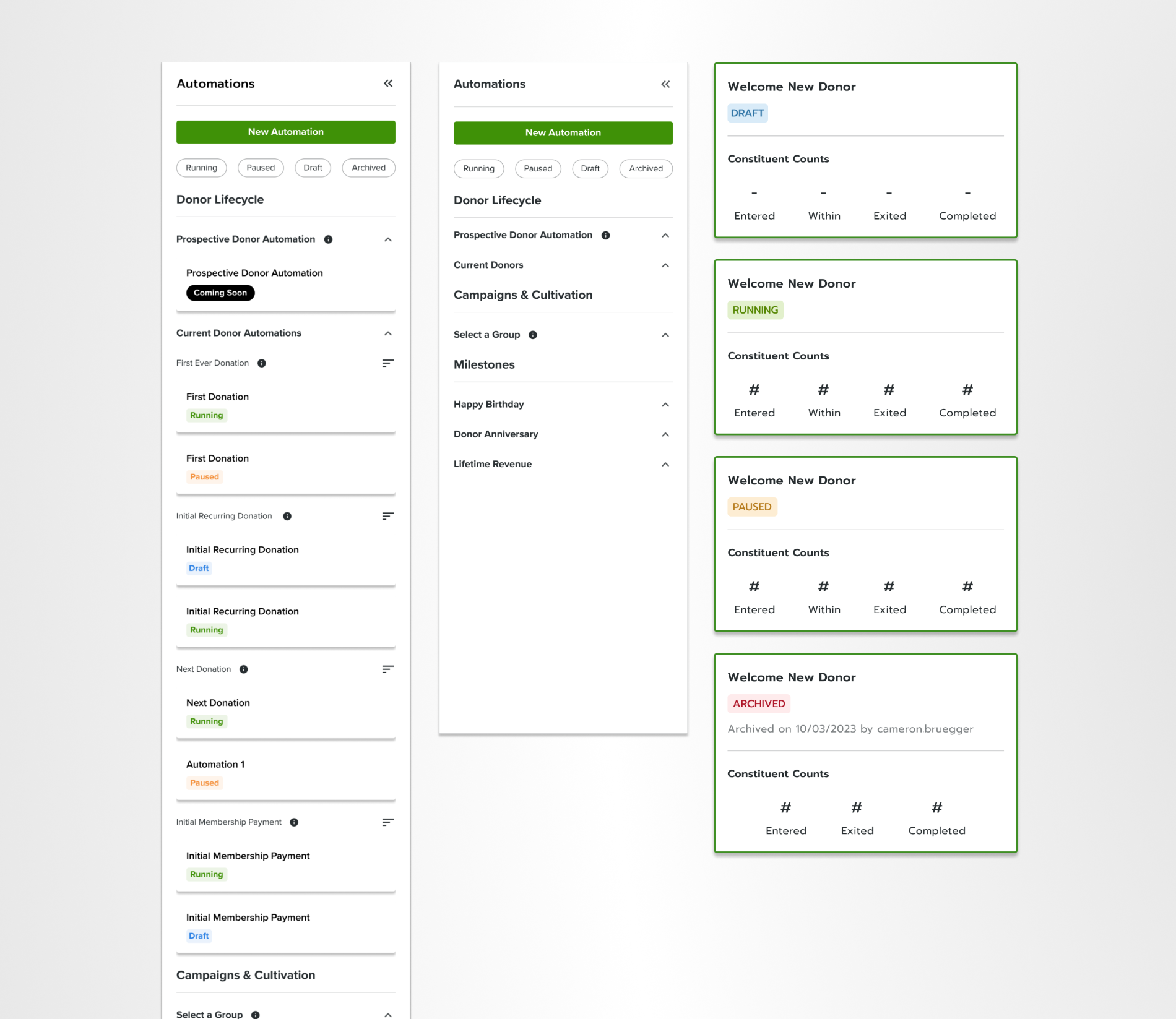
The Automations management view: a left nav grouping automations by Donor Lifecycle, Campaigns, and Milestones, an expanded and collapsed nav state, and automation cards across Draft, Running, Paused, and Archived statuses.
One interface for the whole system. The left nav groups automations the way fundraisers segment their work — Donor Lifecycle, Campaigns & Cultivation, Milestones — and collapses to stay out of the way. Every automation carries a status (Draft, Running, Paused, Archived) and its constituent counts right on the card, so the state of the entire engagement program is legible at a glance.
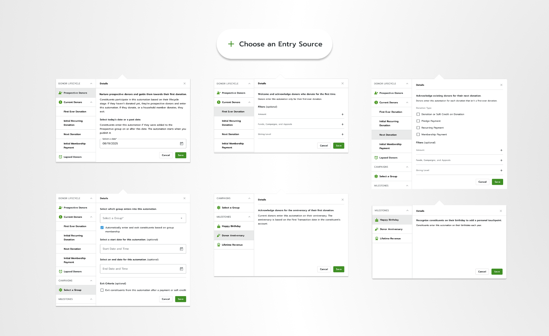
A spread of entry-source configuration panels: Prospective Donors, First Ever Donation, Next Donation, Select a Group, and milestone triggers.
Each entry source has a distinct configuration based on what that donor relationship actually requires. Prospective Donors get a date-based entry with lifecycle exit logic; Next Donation gets optional filters for donation type, amount, and giving level. The taxonomy isn't arbitrary — it maps directly to how fundraising staff segment and talk about their constituents.
crm.bloomerang.co / journey-automation / send-email
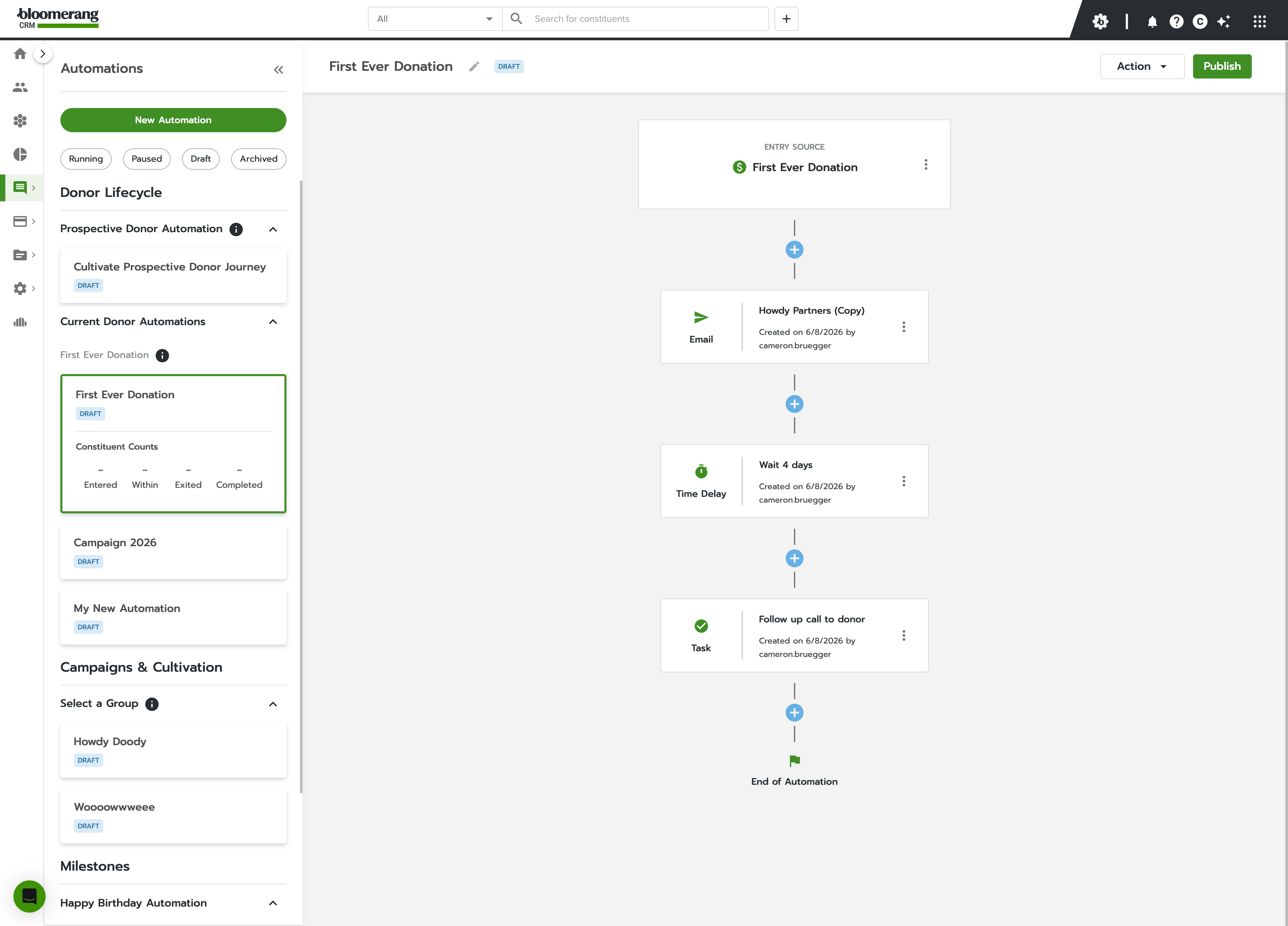
The Send Email step configuration: choose a template or copy an existing email, with a searchable list of emails.
Configuring a step is a single legible choice — pick a template or copy an existing email, and the automation handles the recipient list itself. No list-building, no segmentation detour mid-flow.

05 — What changed

The number you need, where you need it
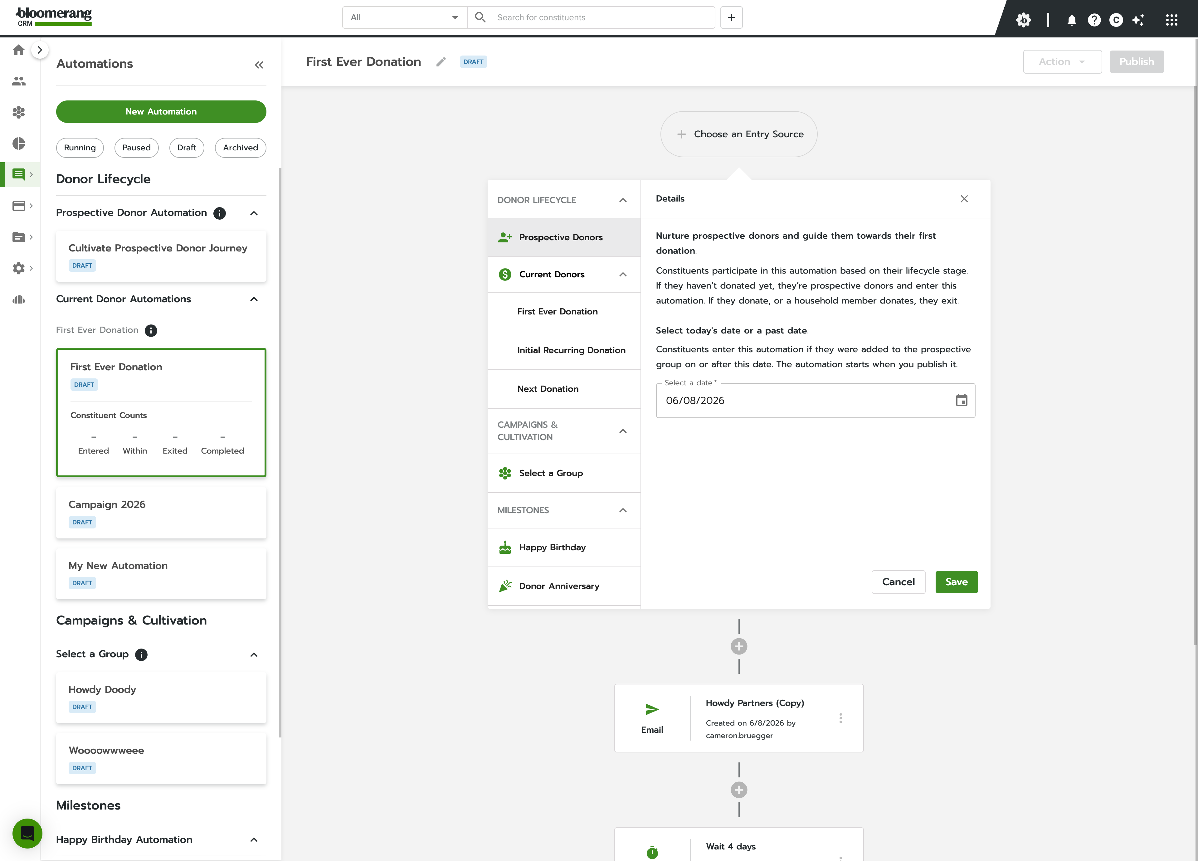
crm.bloomerang.co / journey-automation
An automation card showing constituent counts — Entered, Within, Exited, Completed — surfaced inline beside the builder.
The constituent counts — Entered, Within, Exited, Completed — surface inline on every automation card. A small detail, but it removes a reason to disengage from the tool entirely. No separate reports view, no digging.

Adoption is still climbing — automation is a behavior shift, not just a feature, and nonprofit teams need training and trust before they hand the wheel to a system. But for teams that have embraced it, Journey Automation removes hours — sometimes days — of manual outreach from their workflows.

The foundation is solid. The next challenge is getting users confident enough to use it.